Difference between revisions of "360 Widget"
From unroole CMS wiki
(Created page with "<noinclude>{{for|more information|Widgets}}</noinclude> The 360 Widget gives you the ability to take an collection of images for a single object from different angles and turn...") |
|||
| Line 1: | Line 1: | ||
<noinclude>{{for|more information|Widgets}}</noinclude> | <noinclude>{{for|more information|Widgets}}</noinclude> | ||
| − | |||
| − | |||
| − | |||
| − | |||
| − | |||
| − | |||
{{Css Image Crop | {{Css Image Crop | ||
|Image = 360 Widget Property.png | |Image = 360 Widget Property.png | ||
| Line 14: | Line 8: | ||
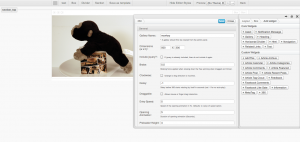
|Description = Property panel for 360 Widget | |Description = Property panel for 360 Widget | ||
}} | }} | ||
| + | |||
| + | The 360 widget gives you the ability to take an collection of images from a [[Gallery Widget|Gallery]] for a single object from different angles and turn it into a gorgeous interactive 360 object. | ||
| + | |||
| + | {{clear}} | ||
| + | |||
| + | == Setup == | ||
| + | |||
| + | Settings up a new 360 widget is easy if you follow these steps: | ||
| + | |||
| + | # Take multiple images of the same object from different angles. | ||
| + | ** Tip: Use a [[http://en.wikipedia.org/wiki/Lazy_Susan|Lazy Susan]] with the object in the center. | ||
| + | # Add all images to the asset library. Ideally through a bulk upload. | ||
| + | # Create a new [[Gallery Widget|Gallery]] | ||
| + | # Add each of the images to the gallery | ||
| + | # Navigate to a page and add the 360 widget | ||
| + | # Select the newly created gallery in the properties of the 360 widget. | ||
| + | ** You may also want to play with other options described below depending on the number of images in the gallery. | ||
| + | # Save | ||
| + | |||
| + | {{clear}} | ||
| + | |||
| + | == Properties == | ||
| + | |||
| + | In the [[Layout Editor]], 360 widget have these properties: | ||
{| class="wikitable" | {| class="wikitable" | ||
| Line 62: | Line 80: | ||
| Type in a custom class, or mutiple classes seperated. These classes can then be used in CSS and Javascript to change the style and behaviour of this widget. | | Type in a custom class, or mutiple classes seperated. These classes can then be used in CSS and Javascript to change the style and behaviour of this widget. | ||
|} | |} | ||
| − | |||
| − | |||
| − | |||
{{clear}} | {{clear}} | ||
Revision as of 17:01, 30 October 2012
For more information, see Widgets.
The 360 widget gives you the ability to take an collection of images from a Gallery for a single object from different angles and turn it into a gorgeous interactive 360 object.
Setup
Settings up a new 360 widget is easy if you follow these steps:
- Take multiple images of the same object from different angles.
- Tip: Use a [Susan] with the object in the center.
- Add all images to the asset library. Ideally through a bulk upload.
- Create a new Gallery
- Add each of the images to the gallery
- Navigate to a page and add the 360 widget
- Select the newly created gallery in the properties of the 360 widget.
- You may also want to play with other options described below depending on the number of images in the gallery.
- Save
Properties
In the Layout Editor, 360 widget have these properties:
| Name | Description |
|---|---|
| Gallery Name: | Enter the gallery name which contains all the images of a single object from different angles. |
| Dimensions: | Enter the dimensions for the widget. |
| Include jQuery: | If your theme does not include jQuery, you must check this in order for 360 to work properly. If your theme includes jQuery you need to make sure you do not check this box, otherwise the jQuery will collide with the theme's jQuery and cause problems. |
| Brake: | Braking force applied when slowing down the free spinning when dragged an thrown. Higher force will stop the spinning faster. |
| Clockwise: | Change the rotation when dragged. |
| Delay | Delay before 360 starts rotating by itself in seconds (set -1 for no auto-play). |
| Draggable | Check to allow mouse or finger drag interaction. |
| Entry Speed | Speed of the opening animation in Hz. Defaults to value of speed option. |
| Opening Animation | Duration of opening animation (in seconds). |
| Preloader Height | Size (height) of a image loading indicator (in pixels) |
| Speed | Animated rotation speed in revolutions per second (Hz). |
| Throwable | Check to allow drag & throw interation. |
| Custom Id | Type in a custom id. This id can then be used in CSS and Javascript to change the style and behaviour of this widget. |
| Custom Classes | Type in a custom class, or mutiple classes seperated. These classes can then be used in CSS and Javascript to change the style and behaviour of this widget. |
