Difference between revisions of "Information Widget"
From unroole CMS wiki
(Created page with "<noinclude> {{for|more information|Widgets}}</noinclude>{{Css Image Crop |Image = Information Widget In Action.png |bSize = 300px |cWidth = 300 |cHeight = 167 |Locat...") |
|||
| (One intermediate revision by one user not shown) | |||
| Line 5: | Line 5: | ||
|cWidth = 300 | |cWidth = 300 | ||
|cHeight = 167 | |cHeight = 167 | ||
| − | |Location = | + | |Location = right |
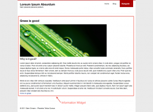
|Description = Using information widget to group text/assets and link together | |Description = Using information widget to group text/assets and link together | ||
}} | }} | ||
| − | Information Widget provides | + | The Information Widget provides a structured way of displaying text, assets and links. It should be used to consistently group common content elements and style them in a specific way. A similar structure can be achieved using either an [[Html Widget]] or [[Boxes]] in combination with [[Text Widget]] and [[Asset Widget]]. |
{{clear}} | {{clear}} | ||
== Properties == | == Properties == | ||
| − | + | ||
{{Css Image Crop | {{Css Image Crop | ||
|Image = Information Widget Property.png | |Image = Information Widget Property.png | ||
| Line 23: | Line 23: | ||
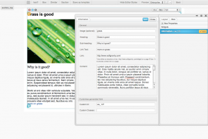
|Description = Property panel for Information Widget | |Description = Property panel for Information Widget | ||
}} | }} | ||
| + | In the [[Layout Editor]], information widget have these properties: | ||
{| class="wikitable" | {| class="wikitable" | ||
| Line 46: | Line 47: | ||
| Content | | Content | ||
| Enter the main content for the information. | | Enter the main content for the information. | ||
| − | |||
| − | |||
| − | |||
| − | |||
| − | |||
| − | |||
|} | |} | ||
| − | + | ''For global widget properties see [[Widgets#Common_Properties|Widgets]]'' | |
| − | + | ||
{{clear}} | {{clear}} | ||
Latest revision as of 09:37, 31 October 2012
For more information, see Widgets.
The Information Widget provides a structured way of displaying text, assets and links. It should be used to consistently group common content elements and style them in a specific way. A similar structure can be achieved using either an Html Widget or Boxes in combination with Text Widget and Asset Widget.
Properties
In the Layout Editor, information widget have these properties:
| Name | Description |
|---|---|
| Image | Enter the name for the image, as you type a dropdown will appear suggesting images from your asset library. |
| Heading | Enter the heading for the information. |
| Sub-heading | Enter the sub heading for the information. |
| Link Text | Enter the link text you want it to display at the end of the content. |
| Link | Enter the link you want your "Link Text" to go to when clicked. |
| Content | Enter the main content for the information. |
For global widget properties see Widgets

