Layouts
Layouts are the backbone of the unroole page creation system. Layouts are used by various items such as Pages and Channel Layouts throughout the CMS to given a consistent look and feel when making content changes. Each layout consists of the following componetns explained later in the document:
Properties
Each layout consists af a few simple properties which govern its overall appearance and structure. These properties are:
- Width (default 960px): This is the default width of the layout (unless overridden by the theme) which is used to compute the size of widgets and boxes.
- Columns (default 12 columns): The number of columns to divide the page into. Column widths are computed using the page width for maximum compatibility.
Depending on the type of item using the layout these, properties may have different impacts. For example a channel layout should have a width spanning the minimum size of the page you wish to support. It can be as many or as few columns as you wish to hold its content. Any layouts which are displayed within a channel layout content box would need to have a smaller layout width to be able to fit within the channel layout. Column numbers between layouts do not need to be the same as the system uses different css per layout to draw the appropriate column size.
Whenever you change a width or column property of a layout, the system will check to make sure that the number of columns divides into the width evenly for proper support with older browsers. To keep things simply you may want to use common widths such as 1368, 1280, 1024 and 960 though odd numbered widths will work as long as the number of columns divide without remainder into the width. Below is an example of combinations of widths and columns which are acceptable:
- 960/4
- 960/12
- 1280/8
- 1280/10
- 1368/9
- 1368/12
More esoteric examples that still work:
- 999/3
- 1000/100
- xxx/1
Notes:
- The maximum number of columns for a layout is capped at 100. If you find you need that granularity of column sizes we suggest using a Static Layout Design approach.
- Whenever the column parameter of a layout is changed the system will automatically attempt to convert box of similar ratios. Therefore moving from a 5 to 10 column grid will result in an identical looking page.
Panels
The layout editor is broken down into a few key components. The following chart outlines common panels/button available in the layout editor and their function.
| Element | Location | Purpose |
|---|---|---|
| Activity Indicator | Topbar | Displays success/failure status of different activities in the layout editor. |
| Layout Container Name | Topbar | The name of the object for which this layout applies. Ex: Pages, Channel Layouts |
| Box | Topbar | Creates a new box on the bottom of the layout. See Boxes |
| Divider | Topbar | Created a new divider box on the bottom of the layout. See Boxes |
| Section | Topbar | Adds a new section to the bottom of the layout. see Sections |
| Content | Topbar (*) | Allows placing of a content box on certain types of layouts. See Boxes |
| Save as template | Topbar (*) | Gives the ability to save the layout (and containing object) as a template. |
| Hide Editor Styles | Topbar | Hides some of the custom layout styles necessary for editing for a quick preview of the layout. |
| Preview | Topbar (**) | Allows a content admin to preview the layout with channel layout and theme of choice applied. The 'in-page' (↻) preview button to refresh the theme within the layout editor. The 'end user' (→) preview button to be taken to the end-user version of that page with the theme applied. |
| Back | Topbar | Will navigate back to the containing object admin panel. |
| Sidebar Breadcrumbs | Sidebar -> Top Nav | Provides a breadcrumb to allow a content admin to navigate back up the hierarchy of the sidebar. |
| Layout properties | Sidebar -> Top Area | Displays the layout properties such as width and columns and allows for editing by content admins. |
| Box/Section/Widget area | Sidebar -> Bottom Area | Displays the hierarchy of the page for easy browsing and editing. |
| Box Actions | Sidebar -> Layout -> Box, Content Area-> Box -> Topbar | Displays the actions available on a box such as adding widgets, editing properties or removing from layout. The content area provides some quick property changes. |
| Box Properties | Sidebar -> Layout -> Box -> + | Displays the actions available on a box such as adding widgets, editing properties or removing from layout. |
| Box Widgets | Sidebar -> Box, Content Area -> Box | Displays all of the widgets that are contained in a box. |
| Widget properties | Sidebar -> Box -> Widget -> Edit, Content Area -> Box -> Widget -> Edit | Displays the properties of a a widget that can be changed. |
* Does not apply to all layouts.
** Provides different functionality per layout containing object.
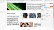
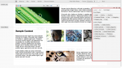
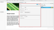
These screenshots display the key components of the layout editor discussed above.
The layout editor topbar. From left to right, update messages, layout object name, box/divider/section buttons, template saving, previews and back button.

The sidebar allows for the majority of property changes on elements of a layout.

The properties of the current layout. These options can be changed via the pencil icon.

The layout area where boxes and widgets in the layout are displayed. Clicking on a box or widget shows the sub-panel for that element.

The sidebar panel displaying the actions available for a box.
Expanded box properties panel.
The widget additional panel displaying widgets that can be added to a box.
The properties panel of an asset widget. Properties can change depending on the widgets functionality.

From left to right the alignment, lock and close icons used to position the sidebar.


Box Model
Every layout in unroole follows a simple box model that is used to organize the various content that is presented on the page. Each layout is composed of the following elements:
- Layout Properties - Used to configure the basics of a layout.
- Sections - Sub divide page for easier styling
- Boxes - Used for laying out content on a page and contain widgets.
- Widgets - Provide different mechanisms for adding content to the page.
These layout elements are then positioned using css either from the system or by the contents of a theme. Each of the elements of a layout are presented in a simple hierarchy presented below:
- Layout Containing Object (Page, Channel Layout)
- Section
- Box
- Widgets
- Box
- Widgets
- ...
- Box
- Section
- ...
- Section
Every section of the layout subdivides a full page providing the user with a mechanism for grouping horizontally related page elements for either design or logical reasons. Next is the box whose size is based on the size of the page and the number of columns within it. Boxes can also expand vertically to encompass content held within them. Lastly are the widgets which holds the content within a box.
Some layouts may also provided special boxes with specific functionality. One such box is the 'content' box used as part of a channel layout. This box tells each channel layout where the page content should be provided when displayed to the end user.
Structure and Markup
Whether or not you are designing a theme or adding stylesheet or javascript elements to a channel it is useful to know the structure and markup of the HTML code generated by a layout. This code is the same for every layout in the system whether it is generated from a page or channel layout.
On the right are two screeenshots which illustrate a fully formed page and the first part of the generated HTML code for that page. The rendered HTML markup gives many different areas for you to reference when digging deep into the HTML/CSS/JS of a layout. You will notice the clear hierarchy of elements as explained in the Layout Box Model article is generated. You should notice a few conventions that are employed in the markup to make it easier to reference elements or build your own HTML as part of an HTML widget.
If you are working directly with the DOM it is useful to know which classes and id's are automatically generated by the system for use by theme builders or through stylesheets. The table below lists the various attributes, what element they are included in and their purpose.
Common Classes
| Format | Example | Elements | Purpose |
|---|---|---|---|
| ul | Layouts | Indicates the beginning of a layout. If directly after the body, then it can be considered the primary channel layout of the page. If nested deeper than this, it is the content layout of the page. | |
| us | Sections | Used on any section elements. | |
| ub | Boxes | Used on any box elements. | |
| uw | Widgets | Used on any widget elements. | |
| ucl | Channel Layouts | Used on any channel layouts. | |
| up | Pages | Used on any page layouts. | |
| ub_xxxxx | ub_content, ub_box, ub_divider | Boxes | A class used to identify a specific category of boxes such as content, dividers or normal boxes. |
| uw_xxxx | uw_navigation, uw_html, uw_asset | Widgets | A class used to identify a specific category of widgets for global styling. Every widget type has a unique class. |
| grid_x_xx | grid_0_25, grid_1_0, grid_0_10 | Boxes | Used for styling purposes to indicate the type of column width that this box takes up as part of the page. Everything is done in 3 digit rounded percentages. ex: 0_25 = 25% of layout width, 1_0 = 100% of layout width, 0_10 = 10% of layout width. Note that this may not apply if the number of column of a layout is changed without changing the box width. |
Extended Classes
| Format | Example | Elements | Purpose |
|---|---|---|---|
| unroole | Layouts | Legacy tag leftover from previous layout versions (don't use). | |
| grid | Layouts | Indicates the beginning of of a new unroole grid. | |
| ub_section | Sections | A simple class indicating a section sub-division. | |
| containers | Sections | The first element inside any section to be used for styling purposes. | |
| inner_box | Boxes | Used within a box for styling purposes. | |
| spacer | Boxes | Used with themes and stylesheets to help add space between boxes. | |
| ub_xxxx | ub_5289, ub_5296 | Boxes | Due to the fact the id's of boxes can be changed this class allows for referencing of the system id even if changed. |
| uw_xxxx | uw_10342, uw_5876 | Widgets | Due to the fact the id's of widgets can be changed this class allows for referencing of the system id even if changed. |
Common ID's
| Format | Example | Elements | Purpose |
|---|---|---|---|
| ulay_xxx | ulay_506 | Pages, Channel Layouts | Derived from the id of the page or channel layout containing the layout. |
| ul_xxx | ul_865 | Layouts | A unique identifier for this specific version of the layout. Useful for targeting different revisions of a layout. |
| ub_0_usl | Sections | A unique identifier indicating the first section of the channel layout on a rendered page. | |
| ub_0_up | Sections | A unique identifier indicating the first section of the page content on a rendered page. | |
| ub_xxxx | ub_5176, my_box, anything_you_want | Boxes | A unique identifier for this box based on the box properties or auto-generated by the system. |
| uw_xxxx | uw_10342, my_widget, anything_you_want | Widgets | A unique identifier for this widget based on the widget properties or auto-generated by the system. |