Difference between revisions of "Layout Panels"
From unroole CMS wiki
(Created page with "<gallery widths="178px" heights="100px"> File:Page Editor with theme preview options.png|Layout editor preview bar. File:Page Editor with in-page preview refresh button highli...") |
|||
| (8 intermediate revisions by one user not shown) | |||
| Line 1: | Line 1: | ||
| + | <noinclude> | ||
| + | {{also|Layouts}} | ||
| + | {{for|more information|Layout Editor}} | ||
| + | </noinclude> | ||
| + | |||
| + | The layout editor is broken down into a few key components. The following chart outlines common panels/button available in the layout editor and their function. | ||
| + | |||
| + | {| class="wikitable" | ||
| + | |- | ||
| + | ! Element | ||
| + | ! Location | ||
| + | ! Purpose | ||
| + | |- | ||
| + | | Activity Indicator | ||
| + | | Topbar | ||
| + | | Displays success/failure status of different activities in the layout editor. | ||
| + | |- | ||
| + | | Layout Container Name | ||
| + | | Topbar | ||
| + | | The name of the object for which this layout applies. Ex: [[Pages]], [[Channel Layouts]] | ||
| + | |- | ||
| + | | Box | ||
| + | | Topbar | ||
| + | | Creates a new box on the bottom of the layout. See [[Boxes]] | ||
| + | |- | ||
| + | | Divider | ||
| + | | Topbar | ||
| + | | Created a new divider box on the bottom of the layout. See [[Boxes]] | ||
| + | |- | ||
| + | | Section | ||
| + | | Topbar | ||
| + | | Adds a new section to the bottom of the layout. see [[Sections]] | ||
| + | |- | ||
| + | | Content | ||
| + | | Topbar (*) | ||
| + | | Allows placing of a content box on certain types of layouts. See [[Boxes]] | ||
| + | |- | ||
| + | | Save as template | ||
| + | | Topbar (*) | ||
| + | | Gives the ability to save the layout (and containing object) as a template. | ||
| + | |- | ||
| + | | Hide Editor Styles | ||
| + | | Topbar | ||
| + | | Hides some of the custom layout styles necessary for editing for a quick preview of the layout. | ||
| + | |- | ||
| + | | Preview | ||
| + | | Topbar (**) | ||
| + | | Allows a content admin to preview the layout with [[Channel Layouts|channel layout]] and theme of choice applied. The 'in-page' (↻) preview button to refresh the theme within the layout editor. The 'end user' (→) preview button to be taken to the end-user version of that page with the theme applied. | ||
| + | |- | ||
| + | | Back | ||
| + | | Topbar | ||
| + | | Will navigate back to the containing object admin panel. | ||
| + | |- | ||
| + | | Sidebar Breadcrumbs | ||
| + | | Sidebar -> Top Nav | ||
| + | | Provides a breadcrumb to allow a content admin to navigate back up the hierarchy of the sidebar. | ||
| + | |- | ||
| + | | Layout properties | ||
| + | | Sidebar -> Top Area | ||
| + | | Displays the layout properties such as width and columns and allows for editing by content admins. | ||
| + | |- | ||
| + | | Box/Section/Widget area | ||
| + | | Sidebar -> Bottom Area | ||
| + | | Displays the hierarchy of the page for easy browsing and editing. | ||
| + | |- | ||
| + | | Box Actions | ||
| + | | Sidebar -> Layout -> Box, Content Area-> Box -> Topbar | ||
| + | | Displays the actions available on a box such as adding widgets, editing properties or removing from layout. The content area provides some quick property changes. | ||
| + | |- | ||
| + | | Box Properties | ||
| + | | Sidebar -> Layout -> Box -> + | ||
| + | | Displays the actions available on a box such as adding widgets, editing properties or removing from layout. | ||
| + | |- | ||
| + | | Box Widgets | ||
| + | | Sidebar -> Box, Content Area -> Box | ||
| + | | Displays all of the widgets that are contained in a box. | ||
| + | |- | ||
| + | | Widget properties | ||
| + | | Sidebar -> Box -> Widget -> Edit, Content Area -> Box -> Widget -> Edit | ||
| + | | Displays the properties of a a widget that can be changed. | ||
| + | |} | ||
| + | |||
| + | ''* Does not apply to all layouts.'' | ||
| + | |||
| + | ''** Provides different functionality per layout containing object.'' | ||
| + | |||
| + | <br /> | ||
| + | |||
| + | These screenshots display the key components of the layout editor discussed above. | ||
| + | |||
<gallery widths="178px" heights="100px"> | <gallery widths="178px" heights="100px"> | ||
| − | File: | + | File:Layotu Editor Topbar.png|The layout editor topbar. From left to right, update messages, layout object name, box/divider/section buttons, template saving, previews and back button. |
| − | File: | + | File:Layout Editor Sidebar.png|The sidebar allows for the majority of property changes on elements of a layout. |
| − | File: | + | File:Layout Editor Properties Panel.png|The properties of the current layout. These options can be changed via the pencil icon. |
| − | File: | + | File:Layout Editor Box and Widget Area.png|The layout area where boxes and widgets in the layout are displayed. Clicking on a box or widget shows the sub-panel for that element. |
| + | File:Layout Editor box panel.png|The sidebar panel displaying the actions available for a box. | ||
| + | File:Layout Editor Expanded Box panel.png|Expanded box properties panel. | ||
| + | File:Layout Editor Expanded Widget Panel.png|The widget additional panel displaying widgets that can be added to a box. | ||
| + | File:Layout Editor Expanded Widget Properties Panel.png|The properties panel of an asset widget. Properties can change depending on the widgets functionality. | ||
| + | File:Layout Editor Sidebar Position Elements.png|From left to right the alignment, lock and close icons used to position the sidebar. | ||
</gallery> | </gallery> | ||
| + | |||
| + | {{clear}} | ||
Latest revision as of 08:47, 18 July 2012
See also: Layouts
For more information, see Layout Editor.
The layout editor is broken down into a few key components. The following chart outlines common panels/button available in the layout editor and their function.
| Element | Location | Purpose |
|---|---|---|
| Activity Indicator | Topbar | Displays success/failure status of different activities in the layout editor. |
| Layout Container Name | Topbar | The name of the object for which this layout applies. Ex: Pages, Channel Layouts |
| Box | Topbar | Creates a new box on the bottom of the layout. See Boxes |
| Divider | Topbar | Created a new divider box on the bottom of the layout. See Boxes |
| Section | Topbar | Adds a new section to the bottom of the layout. see Sections |
| Content | Topbar (*) | Allows placing of a content box on certain types of layouts. See Boxes |
| Save as template | Topbar (*) | Gives the ability to save the layout (and containing object) as a template. |
| Hide Editor Styles | Topbar | Hides some of the custom layout styles necessary for editing for a quick preview of the layout. |
| Preview | Topbar (**) | Allows a content admin to preview the layout with channel layout and theme of choice applied. The 'in-page' (↻) preview button to refresh the theme within the layout editor. The 'end user' (→) preview button to be taken to the end-user version of that page with the theme applied. |
| Back | Topbar | Will navigate back to the containing object admin panel. |
| Sidebar Breadcrumbs | Sidebar -> Top Nav | Provides a breadcrumb to allow a content admin to navigate back up the hierarchy of the sidebar. |
| Layout properties | Sidebar -> Top Area | Displays the layout properties such as width and columns and allows for editing by content admins. |
| Box/Section/Widget area | Sidebar -> Bottom Area | Displays the hierarchy of the page for easy browsing and editing. |
| Box Actions | Sidebar -> Layout -> Box, Content Area-> Box -> Topbar | Displays the actions available on a box such as adding widgets, editing properties or removing from layout. The content area provides some quick property changes. |
| Box Properties | Sidebar -> Layout -> Box -> + | Displays the actions available on a box such as adding widgets, editing properties or removing from layout. |
| Box Widgets | Sidebar -> Box, Content Area -> Box | Displays all of the widgets that are contained in a box. |
| Widget properties | Sidebar -> Box -> Widget -> Edit, Content Area -> Box -> Widget -> Edit | Displays the properties of a a widget that can be changed. |
* Does not apply to all layouts.
** Provides different functionality per layout containing object.
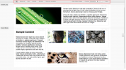
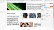
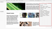
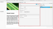
These screenshots display the key components of the layout editor discussed above.


