Difference between revisions of "Layout Panels"
| Line 70: | Line 70: | ||
| Box Properties | | Box Properties | ||
| Sidebar -> Layout -> Box -> + | | Sidebar -> Layout -> Box -> + | ||
| − | | Displays the actions available on a box such as adding widgets, editing properties or removing from layout. | + | | Displays the actions available on a box such as adding widgets, editing properties or removing from layout. |
| + | |- | ||
| + | | Box Widgets | ||
| + | | Sidebar -> Box, Content Area -> Box | ||
| + | | Displays all of the widgets that are contained in a box. | ||
| + | |- | ||
| + | | Widget properties | ||
| + | | Sidebar -> Box -> Widget -> Edit, Content Area -> Box -> Widget -> Edit | ||
| + | | Displays the properties of a a widget that can be changed. | ||
|} | |} | ||
Revision as of 08:12, 13 July 2012
The layout editor is broken down into a few key components. The following chart outlines common panels/button available in the layout editor and their function.
| Element | Location | Purpose |
|---|---|---|
| Activity Indicator | Topbar | Displays success/failure status of different activities in the layout editor. |
| Layout Container Name | Topbar | The name of the object for which this layout applies. Ex: Pages, Channel Layouts |
| Box | Topbar | Creates a new box on the bottom of the layout. See Boxes |
| Divider | Topbar | Created a new divider box on the bottom of the layout. See Boxes |
| Section | Topbar | Adds a new section to the bottom of the layout. see Sections |
| Content | Topbar (*) | Allows placing of a content box on certain types of layouts. See Boxes |
| Save as template | Topbar (*) | Gives the ability to save the layout (and containing object) as a template. |
| Hide Editor Styles | Topbar | Hides some of the custom layout styles necessary for editing for a quick preview of the layout. |
| Preview | Topbar (**) | Allows a content admin to preview the layout with channel layout and theme of choice applied. Additionally can be used for in editor changing of the currently applied theme for design previews. |
| Back | Topbar | Will navigate back to the containing object admin panel. |
| Sidebar Breadcrumbs | Sidebar -> Top Nav | Provides a breadcrumb to allow a content admin to navigate back up the hierarchy of the sidebar. |
| Layout properties | Sidebar -> Top Area | Displays the layout properties such as width and columns and allows for editing by content admins. |
| Box/Section/Widget area | Sidebar -> Bottom Area | Displays the hierarchy of the page for easy browsing and editing. |
| Box Actions | Sidebar -> Layout -> Box, Content Area-> Box -> Topbar | Displays the actions available on a box such as adding widgets, editing properties or removing from layout. The content area provides some quick property changes. |
| Box Properties | Sidebar -> Layout -> Box -> + | Displays the actions available on a box such as adding widgets, editing properties or removing from layout. |
| Box Widgets | Sidebar -> Box, Content Area -> Box | Displays all of the widgets that are contained in a box. |
| Widget properties | Sidebar -> Box -> Widget -> Edit, Content Area -> Box -> Widget -> Edit | Displays the properties of a a widget that can be changed. |
* Does not apply to all layouts. ** Provides different functionality per layout containing object.
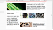
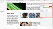
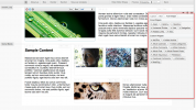
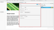
These screenshots display the key components of the layout editor discussed above.
The layout editor topbar. From left to right, update messages, layout object name, box and section buttons, template saving, previews and back button.

The sidebar allows for the majority of property changes on elements of a layout.

The properties of the current layout. These options can be changed via the pencil icon.

The layout area where boxes and widgets in the layout are displayed. Clicking on a box or widget shows the sub-panel for that element.

The sidebar panel displaying the actions available for a box.
Expanded box properties panel.
The widget additional panel displaying widgets that can be added to a box.
The properties panel of an asset widget. Properties can change depending on the widgets functionality.

From left to right the alignment, lock and close icons used to position the sidebar.


